


City Desk

- Details
- Category: City Desk
Five Arrested Following Overnight Vandalism Spree in Billings Heights
BILLINGS — Residents in Billings Heights woke up Wednesday morning to shattered glass, damaged vehicles, and a heavy police presence after authorities say a group went on a destructive overnight vandalism spree through several neighborhood streets.
According to Billings Police, officers responded to reports of property damage around 1:45 a.m. Investigators say five individuals were taken into custody in connection with the case, including 21-year-old Donovan Elkboy and four juveniles ranging in age from 11 to 16 years old.
Authorities allege the group moved through residential areas damaging parked vehicles and other property throughout the neighborhood. Witnesses reported hearing loud noises, yelling, and glass breaking during the overnight hours.
Surveillance cameras from nearby homes reportedly captured footage of objects being thrown at vehicles parked along the streets. Several cars sustained broken windshields, smashed windows, damaged mirrors, and dents to body panels.
Residents spent much of Wednesday morning cleaning debris from sidewalks, driveways, and roadways. Some homeowners described the incident as shocking for an area they normally consider quiet and family-oriented.
Vehicle repair costs are expected to be substantial. Local property owners noted that replacement parts and labor for modern vehicles can quickly add up, especially for newer trucks and SUVs equipped with advanced mirror and safety systems.
Police continue to review evidence and assess the total amount of damage tied to the case. The adult suspect remains in custody while the juveniles are being handled through the appropriate youth supervision process.

- Details
- Category: City Desk
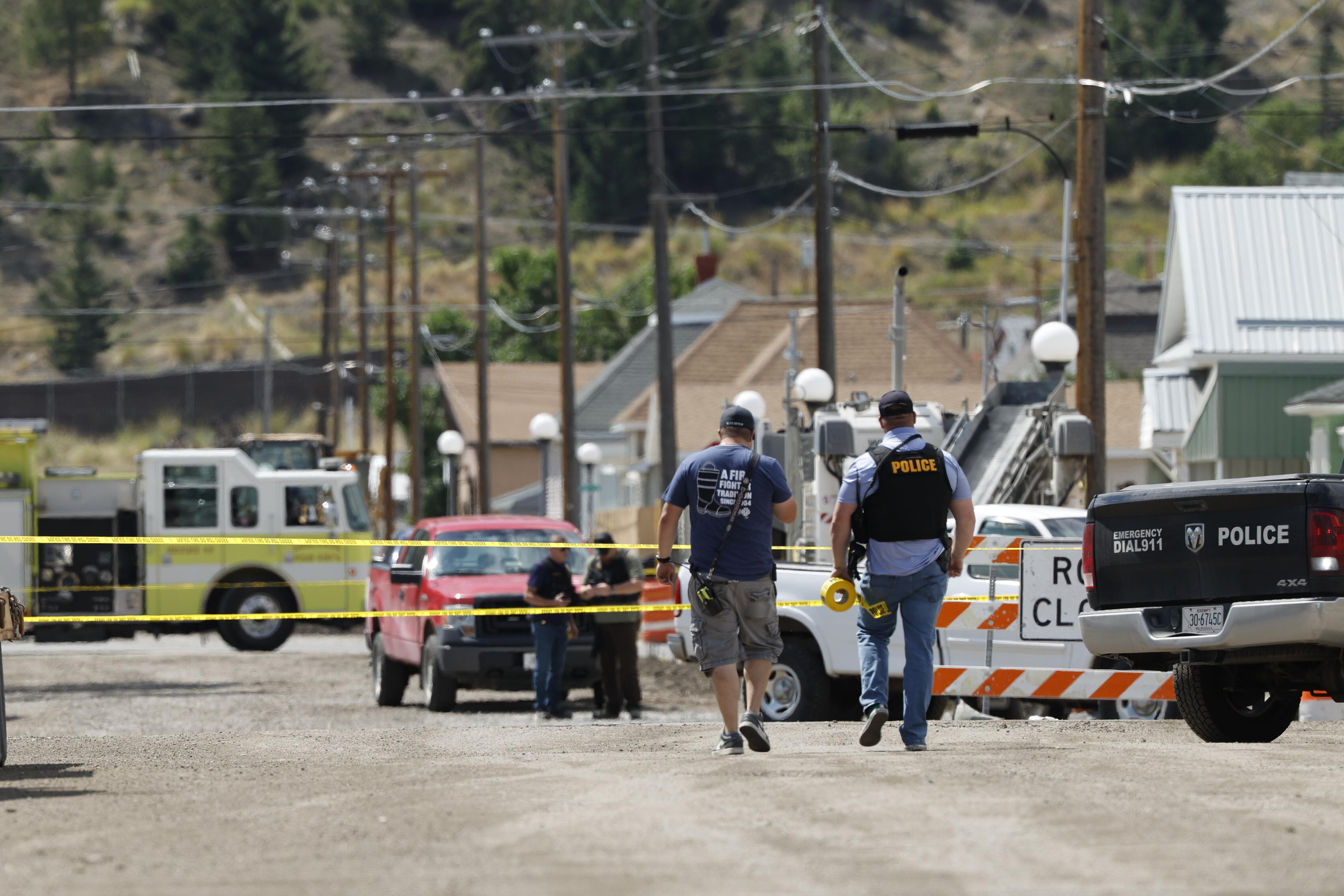
82-Year-Old Man Killed in Officer-Involved Shooting in Butte
BUTTE — Authorities are investigating an officer-involved shooting that left an 82-year-old man dead earlier this week following a reported domestic disturbance at a residence in Butte.
According to authorities, officers were dispatched to the home after receiving reports of a domestic-related incident that required immediate police response. Specific details regarding the original call have not yet been publicly released.
Officials say the situation escalated shortly after officers arrived at the residence. During the encounter, at least one officer discharged a firearm. The 82-year-old man was pronounced dead at the scene.
Investigators have not confirmed whether the man was armed or what events directly led to the use of deadly force. Authorities also have not released information regarding how many officers were involved or how long the incident lasted before shots were fired.
The investigation is now being handled by an outside agency to ensure an independent review of the incident. Officials say investigators are expected to examine body camera footage, collect evidence from the scene, and conduct interviews with officers and potential witnesses.
Law enforcement officials noted that domestic disturbance calls are often among the most unpredictable and high-risk situations officers encounter, frequently involving emotionally charged circumstances that can change rapidly.
Authorities have not indicated whether those factors contributed to the events leading up to the shooting, but officials say every aspect of the encounter will be reviewed as part of the ongoing investigation.
News of the incident spread quickly throughout the Butte community, where officer-involved shootings tend to receive significant public attention. With limited details currently available, many residents are awaiting further information regarding what occurred inside the home.
Officials are asking the public to allow investigators time to complete the review process before drawing conclusions. Authorities say additional information will be released as facts are confirmed and the investigation progresses.
- Details
- Category: City Desk

PNS - Thursday, March 5, 2026 - Advocates for those with disabilities in Idaho and nationwide are alarmed by proposed Medicaid cuts, programs that provide virtual crisis care are making inroads in rural South Dakota and Wyoming, and the mighty bison returns to Texas.

- Details
- Category: City Desk

PNS - Friday, March 6, 2026 - Kristi Noem is fired from her position as Homeland Security Secretary, but moves to a new and unclear role. The Senate Majority Leader blames Democrats for the ongoing DHS shutdown and the House fails to advance a war powers resolution for Iran.